Introduction
One of the most overlooked aspects of home interior design is the subtle yet impactful area between your bed and nightstand. While it may seem like a small detail, defining the space between these two elements can make a world of difference in creating a harmonious and balanced bedroom. Using the right color combinations, you can not only draw attention to the area but also create a visual boundary that enhances the flow and function of the room. Let’s dive into how you can achieve this with style and creativity!
Why Color Matters in Interior Design
Colors do more than just add beauty to a room. They define spaces, create moods, and can influence how we feel within our own homes. When it comes to your bedroom, it’s important to choose colors that promote relaxation but also create a sense of structure. The space between your bed and nightstand is often left unaddressed, but with the right color palette, you can turn this area into a focal point.
Using contrasting or complementary colors can create a visual divide that allows the bed to feel like a cozy oasis while giving the nightstand its own identity. Whether you prefer bold or more muted tones, there are plenty of ways to make this design choice work for you.
How to Choose the Right Color Scheme for Bed and Nightstand
The key to defining the space between your bed and nightstand lies in selecting a color scheme that works with the overall interior of your bedroom. Here are some tips:
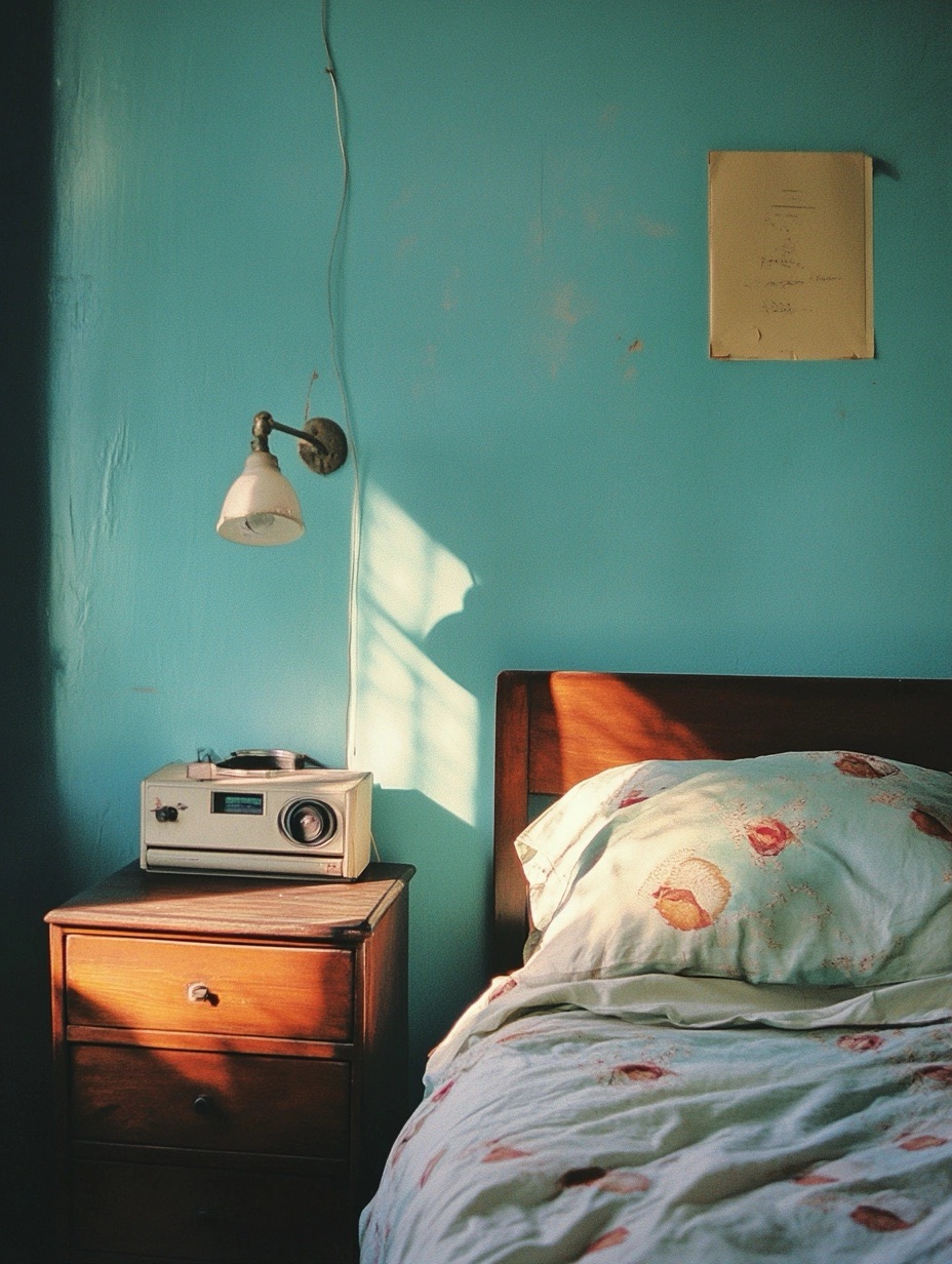
1. Contrast for Clarity
If you want a clear separation between the bed and the nightstand, opt for colors that contrast. For example, if your bed features light tones like whites or pastels, choose a darker shade for your nightstand. This contrast will create an instant visual boundary that adds clarity to the layout.
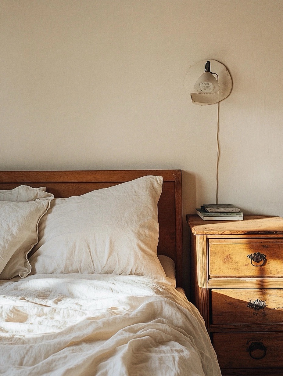
2. Harmonizing with Neutral Colors
For those who prefer a more subtle approach, using neutral tones like beige, gray, or soft taupe can provide a delicate but effective way of defining space. Neutrals create harmony while still offering enough variation to make each piece stand out.
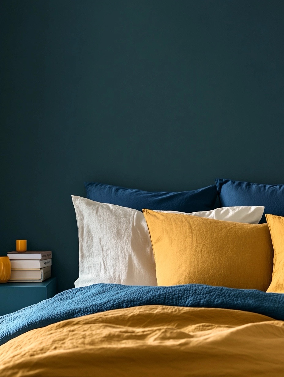
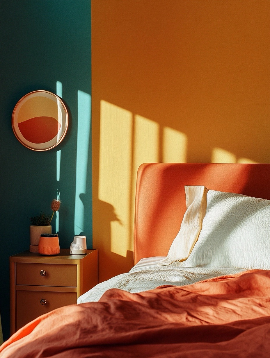
3. Accent Colors to Draw Attention
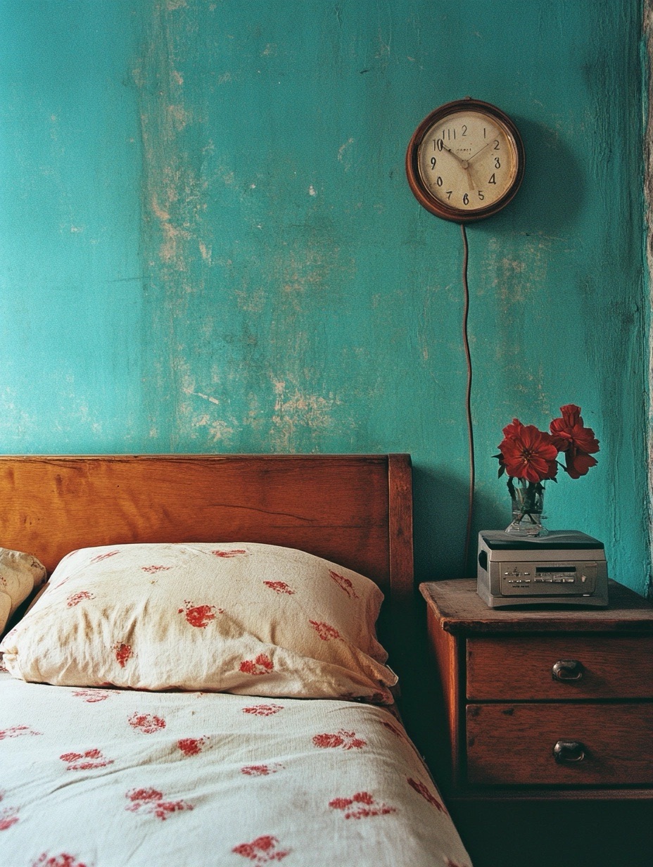
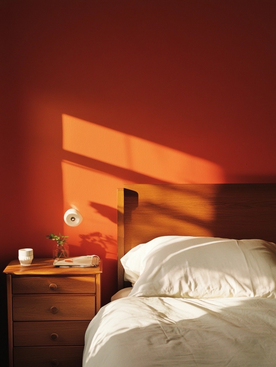
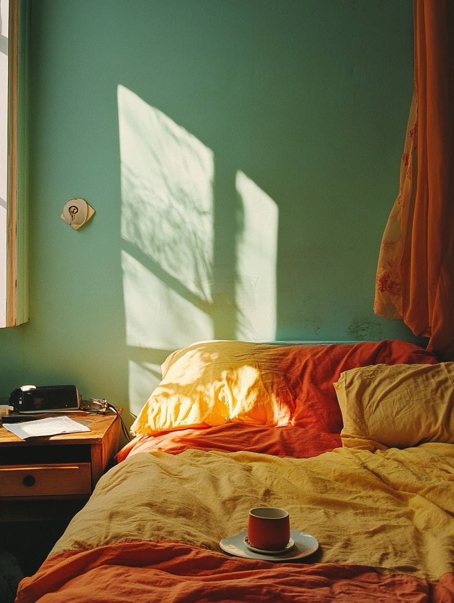
Accent colors are an excellent tool for adding some personality to your room. Try using a vibrant color on the wall behind your nightstand or even on the nightstand itself. Accent shades like mustard yellow, deep teal, or even burnt orange can serve as perfect dividers between your bed and the rest of the room.
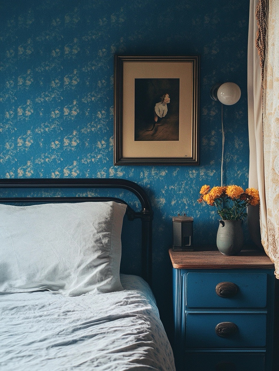
Incorporating Patterns to Define the Space
If solid colors feel too straightforward, patterns are a great way to add another layer of dimension between your bed and nightstand. Stripes, geometric shapes, or even subtle textures can serve as creative dividers. For example, you could use patterned wallpaper or a uniquely designed rug to visually separate the two pieces of furniture while adding interest and depth to your room’s interior.
Using Lighting to Enhance the Color Divide
Lighting plays a significant role in how colors are perceived in a room. The right lighting can enhance the contrast between your bed and nightstand, emphasizing the boundary you’ve created with color. Consider using accent lighting like table lamps, wall sconces, or even LED strips behind the furniture to highlight this divide. Warm-toned lights paired with cooler color palettes can add a cozy but modern aesthetic to your bedroom.
Materials Matter: Mixing Textures for Added Contrast
Another way to create a boundary between your bed and nightstand is by using different textures. For instance, if your bed has a sleek, upholstered headboard, consider choosing a nightstand with a natural wood finish. The contrast between smooth fabric and rough wood adds both visual and tactile diversity to your interior space.
Additionally, you could layer textures with your bedding and decor. A fluffy comforter paired with a metallic lamp on the nightstand, for example, creates a distinct contrast that is pleasing to the eye and touch.
Maximizing Space with Colorful Rugs
A well-placed rug can be an excellent way to define the space between your bed and nightstand. Choose a rug that incorporates colors from both your bed and nightstand, helping to tie the area together while maintaining a clear boundary. Patterns, textures, and colors in the rug can emphasize the divide, adding a layer of coziness and structure to your bedroom’s interior design.
The Role of Wall Art and Decor
Wall art is another fantastic way to visually separate the bed from the nightstand. Hanging a piece of art directly above the nightstand that contrasts in color or style with the bed can serve as a functional focal point. Alternatively, a gallery wall with a cohesive color scheme that ties both the bed and nightstand together can create a balanced look that doesn’t feel disjointed.
Small Details That Make a Big Difference
Sometimes, it’s the little things that make the biggest impact. Consider incorporating small decorative items, like vases, plants, or picture frames, that feature colors from both your bed and nightstand. These items can act as bridging elements that unify the space without overwhelming the room.
Using these decorative accents to subtly reinforce the color divide will ensure that the design feels cohesive and intentional.
FAQs
How can I use color to make my bedroom look bigger?
Using light, neutral colors such as white, cream, or light gray can make a room appear larger and more spacious. By incorporating these colors into the space between your bed and nightstand, you can create the illusion of more space while still defining the area.
What colors work best for a small bedroom?
In small bedrooms, it’s best to stick to a neutral palette or soft pastels. These colors reflect light and create a more open feel. Adding a pop of color between the bed and nightstand can help draw the eye and add interest to the room.
How do I choose accent colors for my bedroom?
Choose accent colors based on the mood you want to create. For a relaxing space, consider soft blues or greens. If you prefer a more vibrant, energetic feel, opt for bold colors like orange or yellow.
Should the nightstand match the bed?
While matching your nightstand to the bed can create a cohesive look, it’s not necessary. Mixing styles and colors can add interest and make each piece stand out.
Can I use wallpaper to define the space between my bed and nightstand?
Yes! Wallpaper can be a fantastic tool for creating a visual boundary. Choose a patterned or textured wallpaper that complements the rest of the room but stands out enough to define the area between the bed and nightstand.
How does lighting affect color perception in a room?
Lighting can dramatically change how colors are seen. Warm lighting can soften cooler colors, while cool lighting can make warm colors pop. Consider your room’s lighting when choosing your color scheme.
Conclusion
Creating a clear boundary between your bed and nightstand using color combinations is a simple yet effective way to elevate your bedroom’s interior design. By thoughtfully selecting the right hues, patterns, and materials, you can define these spaces while maintaining a cohesive and stylish look. Whether you prefer bold contrasts or subtle transitions, there’s a color solution that’s perfect for every room.
Leave a Reply